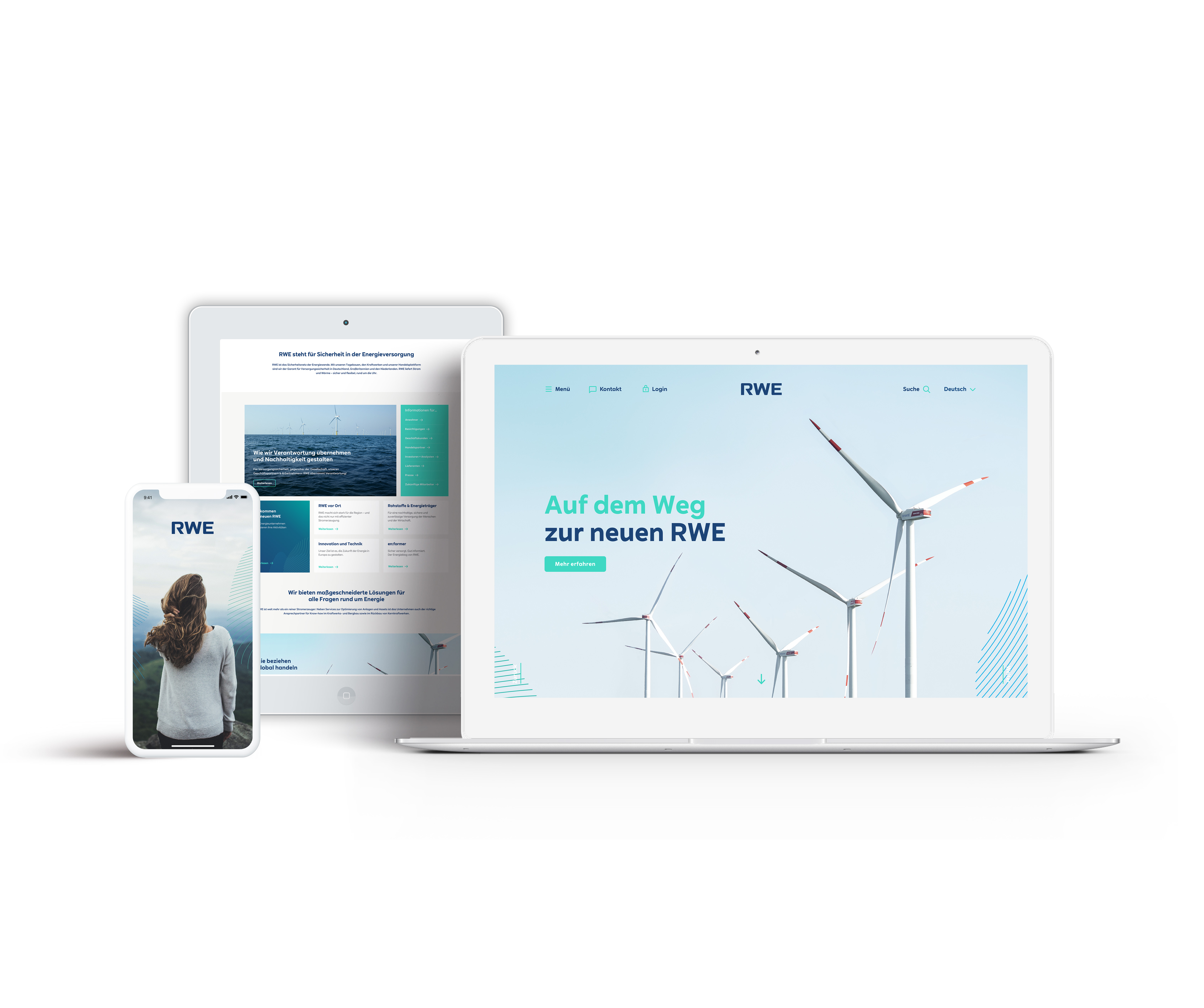
My first major project here at Scholz & Friends in Berlin was the redesign of the “new RWE”, a big energy supplier from germany that is now becoming one of the leading companies in renewable energy.
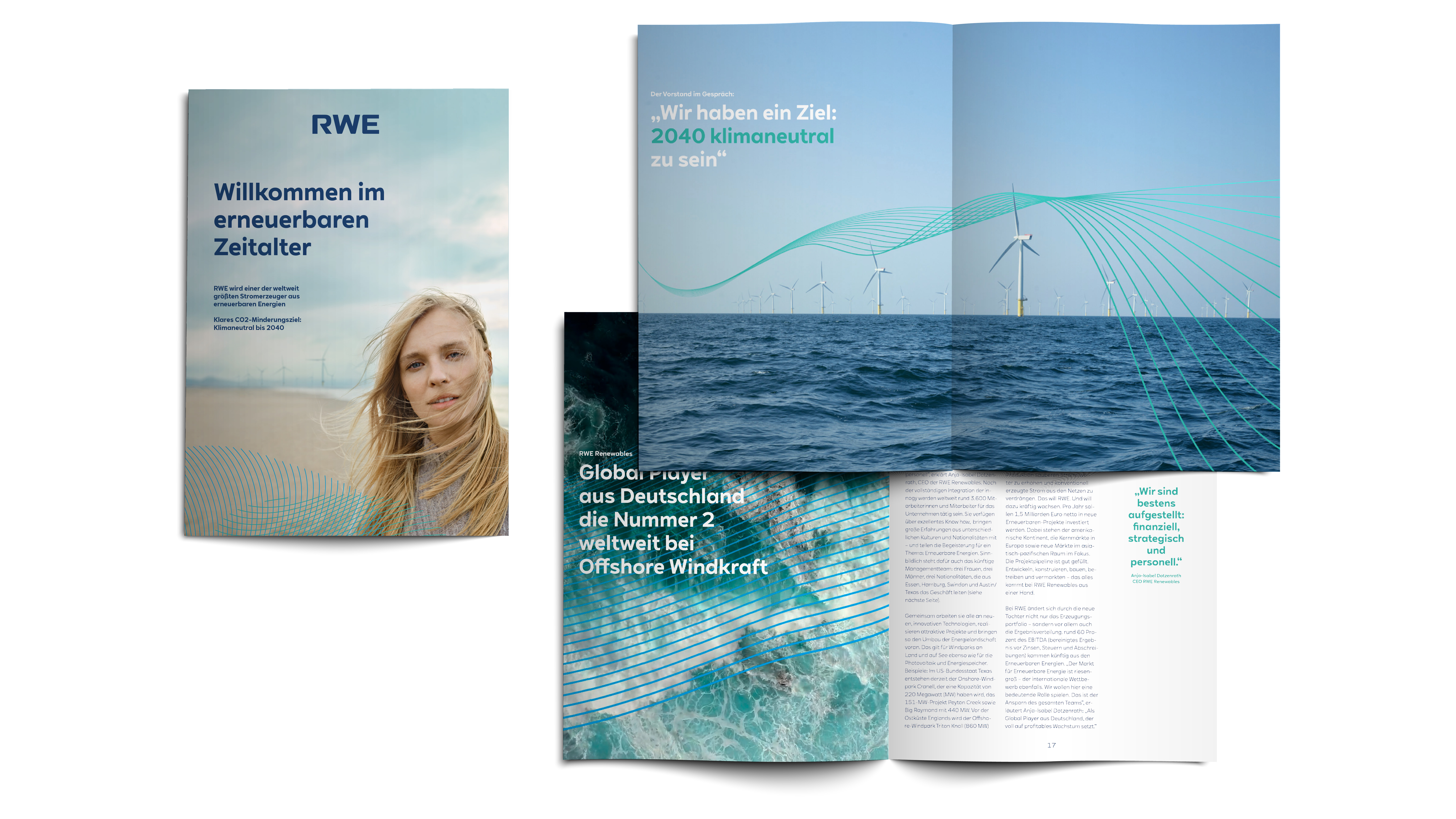
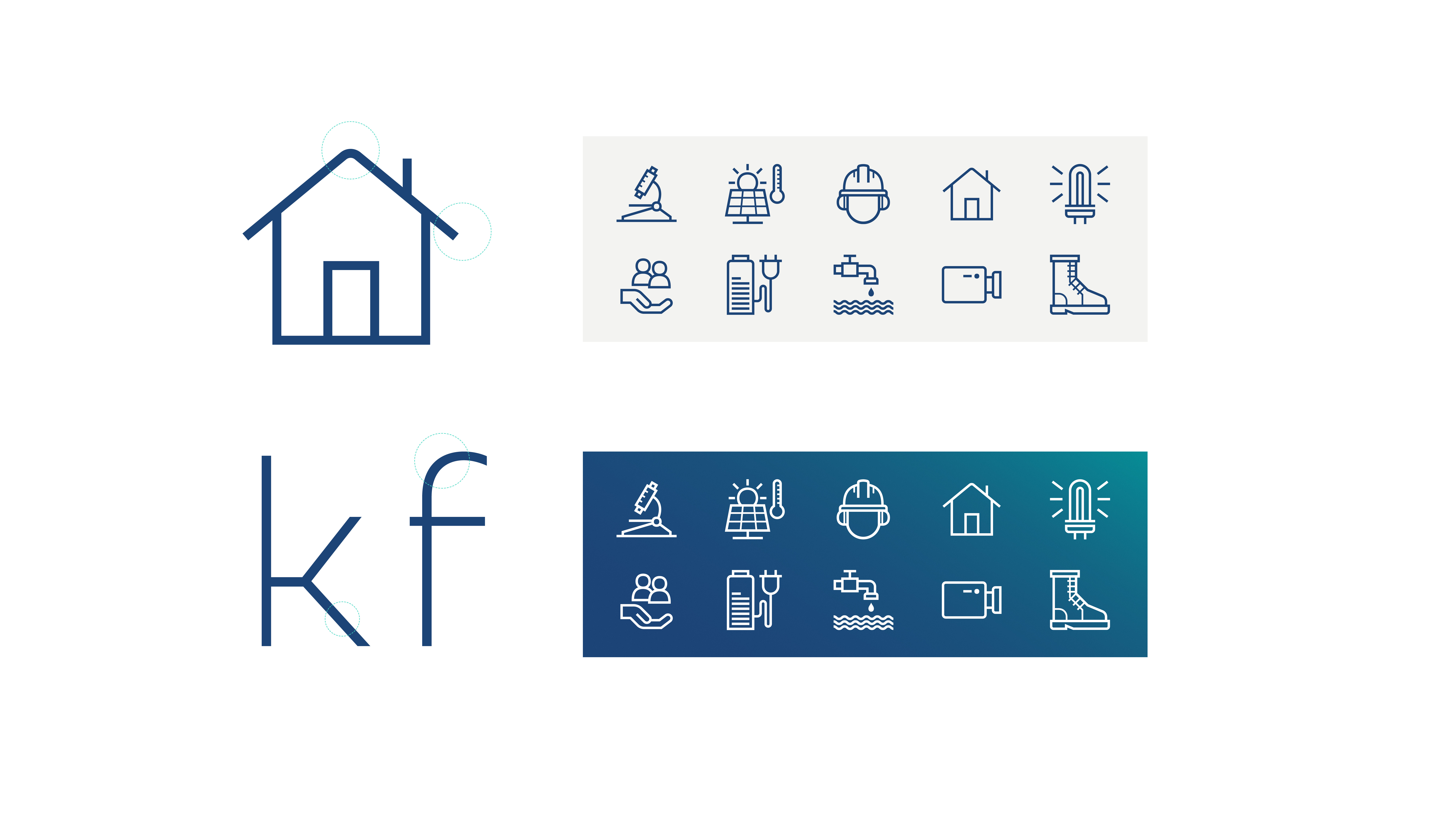
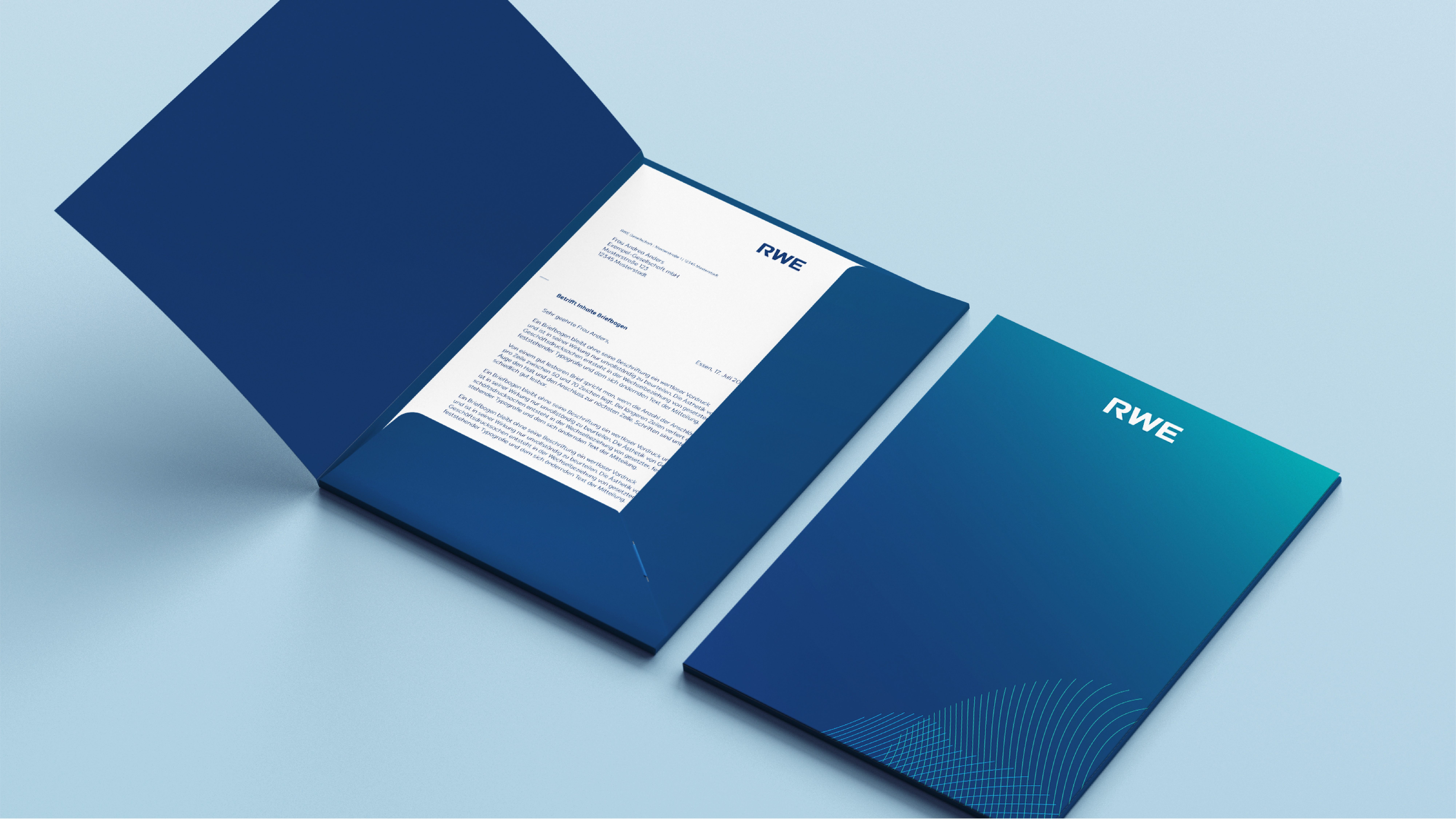
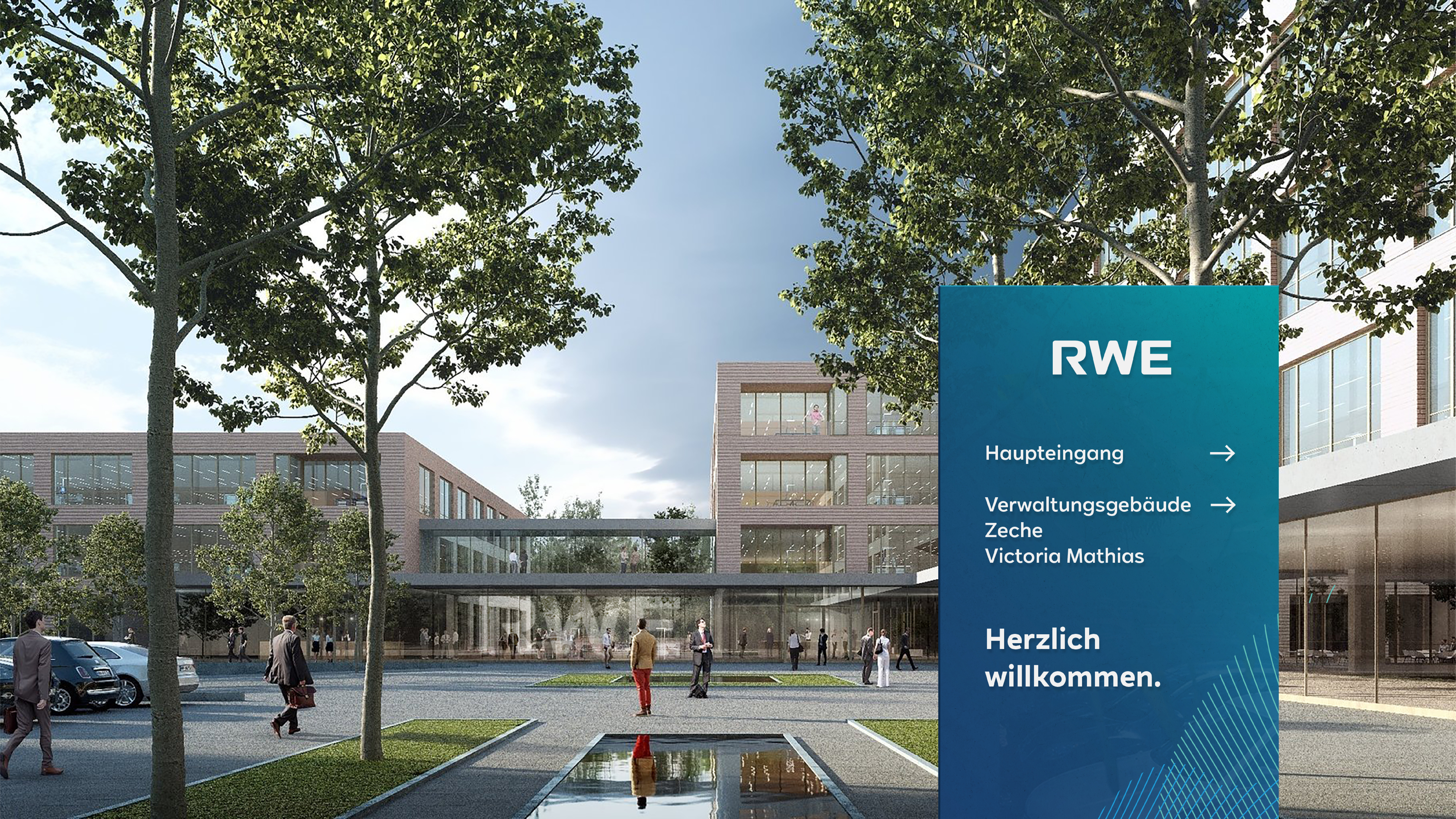
We got tasked to put the companies appearance into an according way. This included a logo redesign, redefining brand colours, a new custom typeface, the art direction for the visuals, stationaries, even icons and signage.
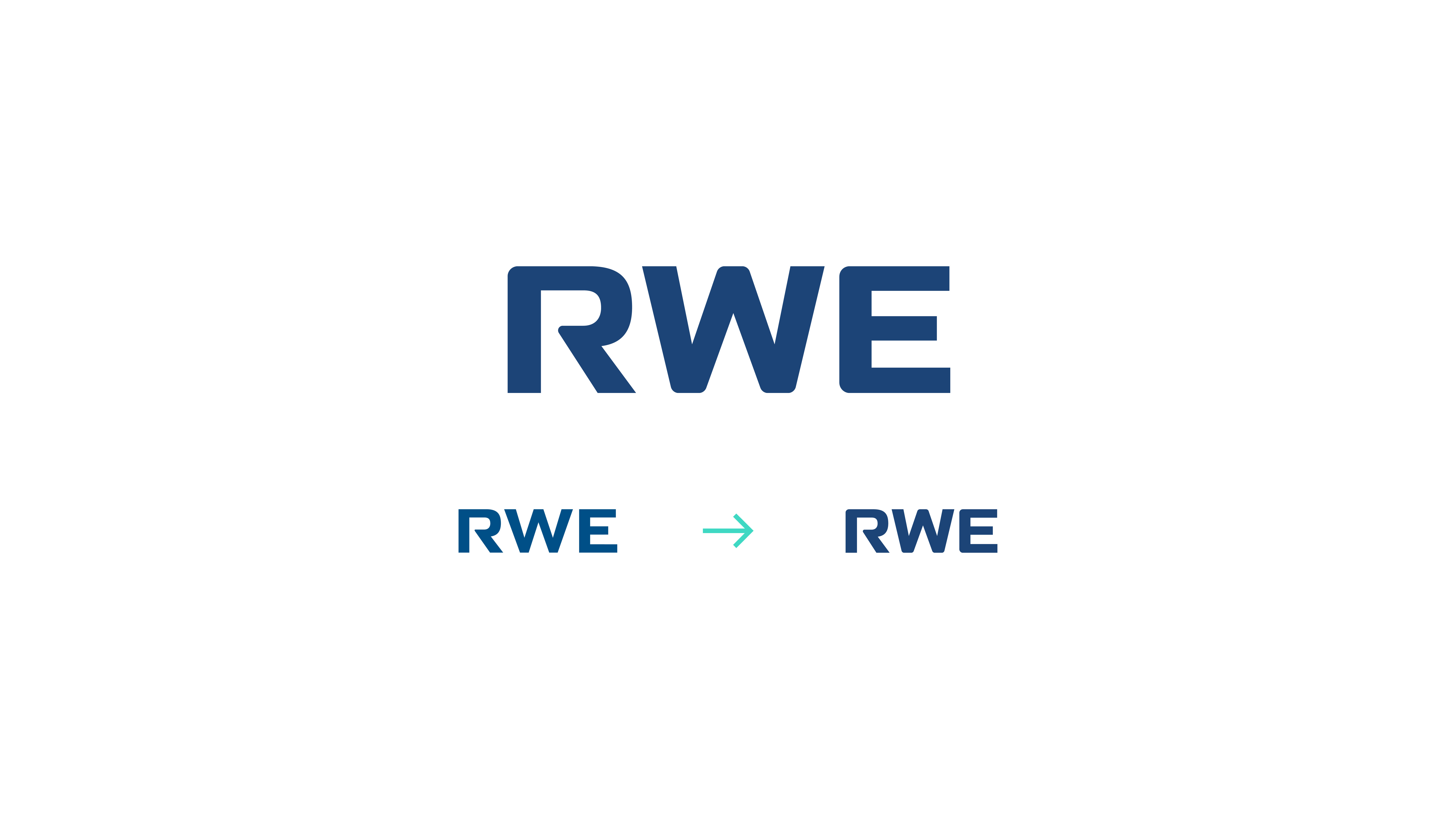
The Logo got reincarnated by keeping the old letter R but reflecting the new brands typeface. Furthermore the Logos corners got softened up and overall it now has a better readability on small devices.
“RWE SANS”, a modern typeface consisting of geometric shapes and clean cuts. The Typeface is also reflected in the new icon-set.
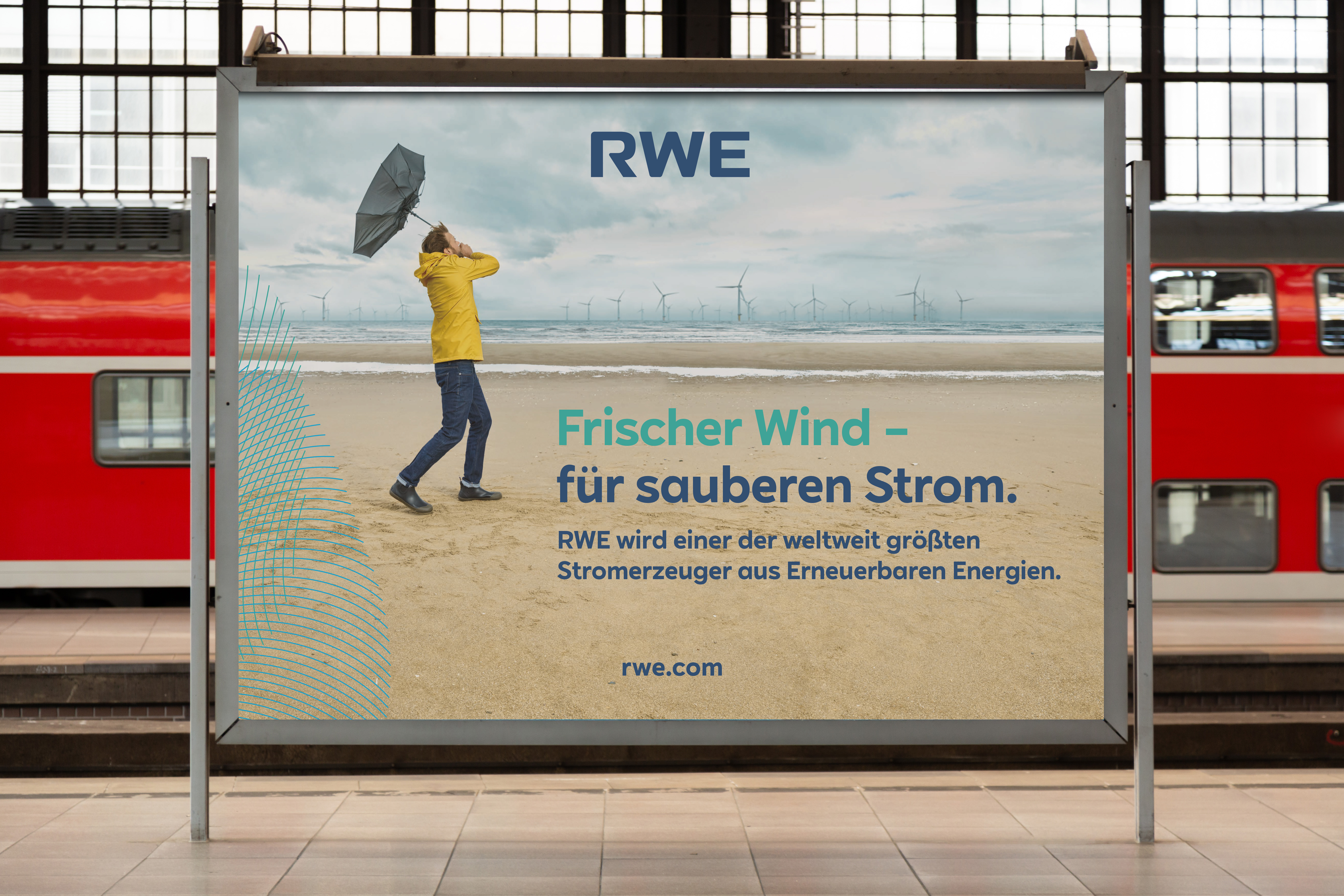
The main graphic assets are inspired by topographic lines and the graphic lingo which is used to visualize weather conditions. These so called energy fields set the transition between the graphic world and the visuals and emphazise both movement and power.
The brand colours got extended to maintain heritage but also showing the transition into more natural energies as well as a more brighter appearance on digital screens.
